
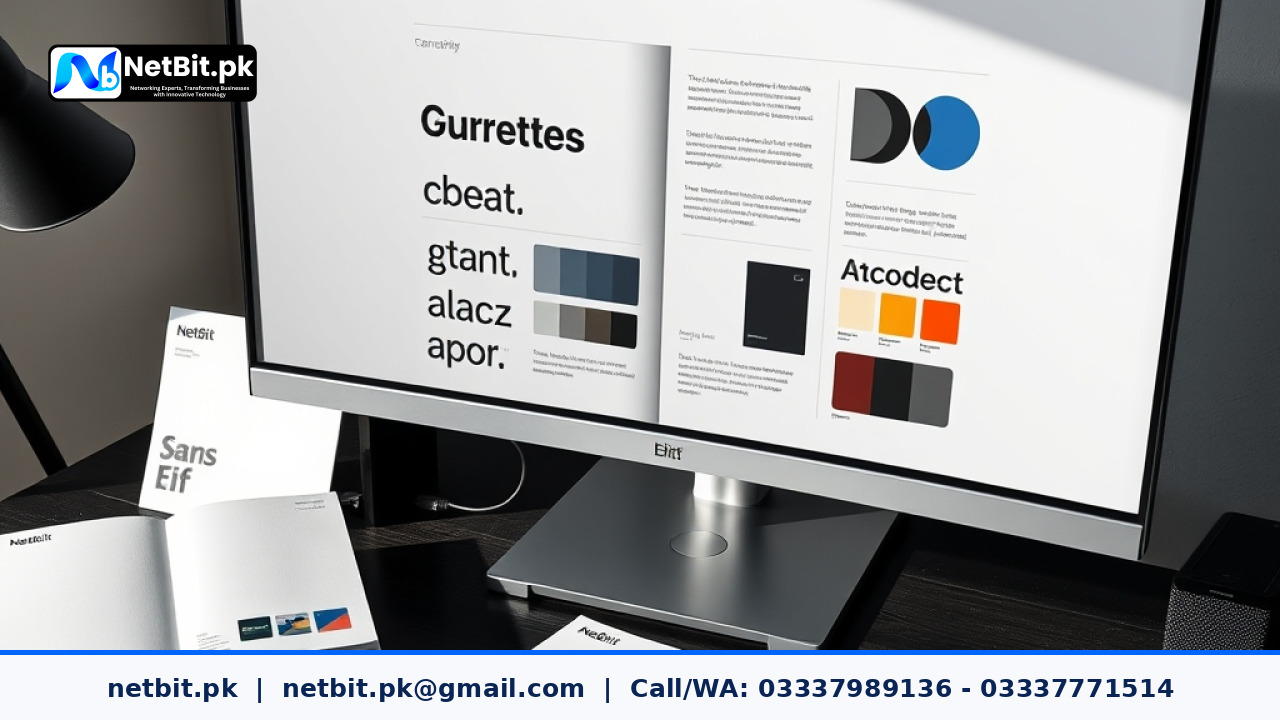
The Importance of Font Selection in Brand Identity
Typography is one of the most visible parts of any business brand. When people visit your website, read your product catalog, or open an official proposal, the fonts you use speak before they read a single sentence. Fonts convey personality, clarity, and seriousness. Choosing the wrong font can make a well-established company look disorganized or amateurish, while a thoughtful font pairing creates immediate trust and readability.
Many business owners focus almost entirely on their logo graphic or brand colors and treat typography as an afterthought. However, your logo only appears in a few places, while your brand fonts carry all your messages, reports, service presentations, and customer communications. Understanding the basics of font selection helps you make decisions that keep your business looking professional across every medium.
Understanding the Main Font Categories
Before you begin pairing typefaces, it helps to understand the core categories of fonts and the impressions they typically communicate:
- Serif Fonts: These typefaces feature small decorative strokes or feet at the ends of letters. Common examples include Times New Roman, Georgia, and Garamond. Serif fonts represent tradition, authority, trust, and reliability. They work exceptionally well for legal firms, universities, financial institutions, and editorial publications.
- Sans-Serif Fonts: These fonts do not have decorative feet. Common examples include Inter, Roboto, Arial, and Open Sans. Sans-serif fonts feel modern, clean, straightforward, and efficient. Because they render clearly on computer monitors and smartphone screens, they are the standard choice for software companies, digital agencies, and technology services.
- Slab Serif Fonts: These fonts feature bold, thick, block-like serifs. They provide a sturdy, confident, and industrial feel. They are often used for strong headlines in manufacturing, logistics, or engineering branding.
- Script and Display Fonts: These fonts mimic handwriting or feature decorative artistic shapes. While they can add personality to a specialty logo or packaging detail, they are difficult to read in long paragraphs and should almost never be used for general body text.
Core Rules for Pairing Brand Fonts
A good brand identity usually relies on two carefully chosen typefaces: one primary font for major headlines and titles, and one secondary font for body copy, descriptions, and captions. Using more than three distinct fonts creates clutter and confusion. Here are the core rules to follow when pairing fonts for your business:
1. Create Clear Contrast, Not Conflict
The golden rule of font pairing is contrast. If two fonts look almost identical but have subtle, mismatched differences, readers sense something is wrong even if they cannot explain why. For example, pairing two similar sans-serif fonts often looks like an accidental mistake.
Instead, choose fonts with distinct roles. A traditional serif heading paired with a clean, neutral sans-serif body creates a balanced harmony between authority and modern readability. Alternatively, you can use a strong, geometric sans-serif for main titles and a humanist sans-serif for body text.
2. Establish a Strict Visual Hierarchy
Visual hierarchy guides the reader's eye naturally down the page. Your reader should instinctively know what is a major title, what is a section header, and what is supporting text. You achieve this through differences in font weight, size, letter spacing, and line height.
Ensure your chosen font family includes multiple weights such as Light, Regular, Medium, Semi-Bold, and Bold. Having these weights within the same font family allows you to build hierarchy effortlessly without introducing unnecessary extra typefaces.
3. Prioritize Legibility and Practical Use
A font might look artistic on a billboard concept, but how does it perform in a 10-point font size on an invoice printed on standard office paper? How does it look on an Android phone over a mobile browser?
Body text must always be easy to read at small sizes. Avoid overly thin weights that disappear on low-resolution displays, and avoid overly condensed letterforms that bunch together. Generous x-height (the height of lowercase letters relative to uppercase letters) and open letter counters make body text comfortable to read over long paragraphs.
Building a Brand Typography Palette: A Step-by-Step Approach
At netbit tech software house, we recommend approaching typography as a structured system rather than an emotional guess. Here is a practical workflow you can follow to build your brand font palette:
- Define Your Brand Personality: Decide whether your organization needs to project formal stability, modern technical expertise, approachable warmth, or creative energy.
- Select Your Primary Header Font: Choose a typeface that reflects that personality strongly in headings, banners, and marketing titles.
- Select a Neutral Workhorse Font: Find an exceptionally readable, clean font for paragraphs, technical documentation, tables, and system interfaces.
- Test Across Multiple Formats: Test your font pairing on a website layout, a business card, an invoice, and a mobile screen. Ensure that numbers, punctuation marks, and special symbols look crisp and aligned.
- Document Font Rules: Write down font weights, sizes, and line-spacing standards in your brand documentation so every team member and designer applies them consistently.
Common Typography Mistakes Growing Businesses Make
Many regional businesses in Pakistan face common branding challenges when selecting their visual assets. Avoiding these basic pitfalls will instantly elevate your professional image:
- Using Decorative Fonts for Body Text: Cursive scripts or heavy display fonts should never be used for paragraphs. If customers struggle to read your pricing or service descriptions, they simply leave.
- Forgetting Proper Licensing: Free fonts downloaded from random websites often lack commercial licensing rights. Always ensure your chosen fonts are open-source (such as Google Fonts) or properly purchased commercial licenses.
- Ignoring Line Spacing and Paragraph Margins: Even beautiful fonts look cluttered if lines of text are crammed together. Maintain a line height of roughly 1.5 to 1.6 times the font size for body text.
- Inconsistency Between Digital and Print Materials: Using one font style on your social media graphics and completely different fonts on your office documents weakens brand recognition. Brand equity grows through repetition.
By treating typography as an essential pillar of your visual identity, your business communicates credibility, attention to detail, and quality before a customer even contacts your office.
Transform Your Business Identity with NetBit Tech
Every interaction a customer has with your business either builds confidence or creates doubt. When your brand visuals, typography, and digital presence look sharp, balanced, and unified, customers immediately perceive your services as reliable and high quality. At NetBit, our team at netbit khuzdar and throughout the wider netbit tech organization helps growing businesses, organizations, and startups establish unforgettable, polished brand systems from the ground up.
Whether you need a complete corporate visual identity, custom logo design, typography guidelines, or modern software development, netbit software provides the technical and creative expertise your brand deserves. Visit us online at netbit.pk to explore our solutions and consult with our design specialists. When you realize that your brand deserves the respect and authority that only professional design can deliver, taking the next step and contacting NetBit is the natural decision that will elevate your business above the competition today.


Reader comments.
Share your question, suggestion or experience related to this article.
No comments yet
There are no approved comments on this article yet. You can be the first person to leave one.