
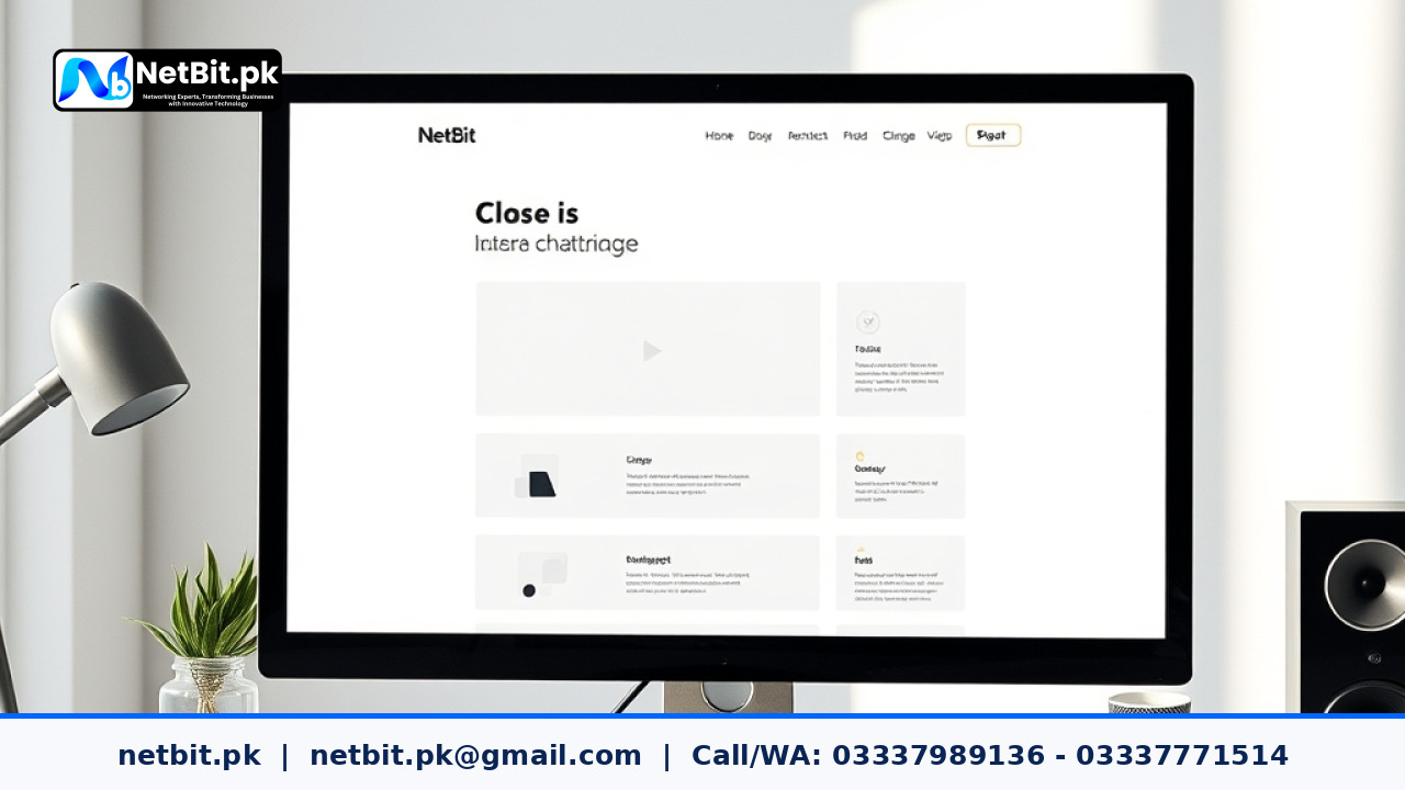
Understanding White Space in Web Design
When people look at a website, they often focus only on text, images, and buttons. However, one of the most powerful elements in web design and UI UX is actually the empty space between these items. This empty area is known as white space or negative space. It does not mean the color must be white; it simply refers to any blank area that separates design elements.
At netbit, our team often reminds clients that a crowded website can confuse visitors. When every inch of a screen is filled with text or banners, the human eye gets tired quickly. Using breathing room helps guide the user's gaze naturally from one section to the next without feeling overwhelmed.
Why Empty Space Matters for Users
Good layout planning makes a digital product easy to use. Here are a few reasons why negative space is important:
- Better Readability: Paragraphs with enough padding and line spacing are much easier to read, especially on smaller mobile screens.
- Clear Focus: Placing blank space around an important call-to-action button helps users find it instantly.
- Professional Look: Clean layouts project trust and credibility compared to cluttered pages.
Macro vs. Micro White Space
Designers generally divide negative space into two main types. Understanding both helps when planning a layout for your next digital project.
Macro Space
Macro space refers to the large empty areas between major layout sections, such as the margins on the left and right sides of a webpage, or the space between a header and the main content area. It frames the entire page and gives it structure.
Micro Space
Micro space is the smaller distance between smaller elements. This includes the space between letters, words, list items, and icons. Proper micro space ensures that menu links do not crowd each other, making them easy to tap on touchscreens.
Practical Tips for Better Spacing
Applying good spacing principles does not require an advanced degree in art. You can improve your layouts by keeping a few practical ideas in mind:
- Start with a Grid: Use a structured grid system to maintain consistent margins and padding across all pages.
- Prioritize Content: Give the most important elements, like headings and main buttons, more breathing room than secondary text.
- Test on Mobile Devices: What looks fine on a large desktop monitor might feel cramped on a smartphone. Always check your spacing on smaller screens.
- Keep it Consistent: Use uniform spacing rules throughout your site so the overall visual style feels connected and organized.
If you are planning a new web project and need professional guidance on layout structure, the team at netbit tech is always ready to help businesses and students build clean, user-friendly digital experiences.
Conclusion
White space is not wasted space. It is a fundamental tool in web design and UI UX that improves readability, focuses attention, and creates a pleasant browsing experience. By keeping your layouts simple and giving your content room to breathe, you make your website much more effective for every visitor.



Reader comments.
Share your question, suggestion or experience related to this article.
No comments yet
There are no approved comments on this article yet. You can be the first person to leave one.