
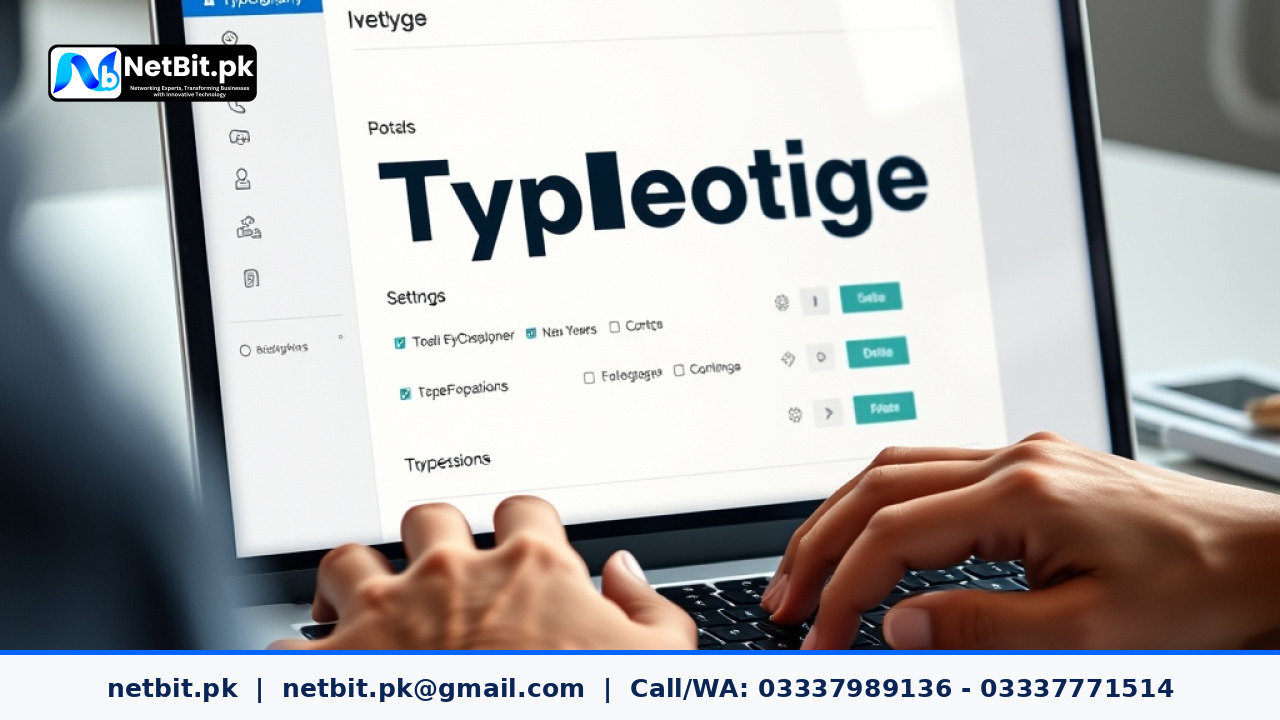
Understanding Responsive Typography in Modern Web Design
In the digital landscape of Pakistan, users access websites from a diverse range of devices, from high-end smartphones to older desktop monitors. One of the most overlooked aspects of web design is responsive typography. It is not just about making text fit on a screen; it is about ensuring that your content remains legible, accessible, and visually balanced regardless of the user's hardware.
Why Typography Matters for Your Business
Your website is often the first interaction a potential client has with your business. If your text is too small, cramped, or difficult to read on a mobile device, users will likely leave your site immediately. Good typography establishes hierarchy, guiding the reader’s eye to your most important information—such as your service offerings or contact details.
Practical Steps for Better Text Scaling
To implement responsive typography, avoid using fixed pixel sizes. Instead, consider these best practices:
- Use Relative Units: Use
remoreminstead ofpxfor font sizes. This allows text to scale relative to the browser's default settings, which is essential for accessibility. - Establish a Type Scale: Define a consistent ratio for your headings and body text. A common approach is the Major Third scale (1.250), which keeps proportions consistent from mobile to desktop.
- Manage Line Length: Aim for 45 to 75 characters per line. Text that is too wide or too narrow can cause eye fatigue for your readers.
- Optimize Line Height: As screen width changes, adjust your line-height (leading). Generally, larger text requires tighter line spacing, while smaller text needs more breathing room.
Common Pitfalls to Avoid
Many developers make the mistake of setting a single font size for all breakpoints. This leads to text that is either oversized on mobile or microscopic on 4K monitors. Always test your designs on real devices. If your website looks good on your laptop but fails on a standard Android phone, you are losing potential customers.
Professional Web Design Services with NetBit
At NetBit Software House & Technology, we understand that great design is not just about aesthetics—it is about performance and user experience. Whether you are a startup in Khuzdar or an established enterprise in Pakistan, our team specializes in creating custom web applications and responsive interfaces tailored to your specific business goals.
Beyond design, NetBit offers comprehensive IT solutions, including custom software, networking infrastructure (such as Cat6 cabling and fiber optics), and professional CCTV installation. We provide the technical backbone your business needs to grow. Contact netbit.pk today to discuss how our expert team can elevate your digital presence and ensure your infrastructure is built for reliability and success.


Reader comments.
Share your question, suggestion or experience related to this article.
No comments yet
There are no approved comments on this article yet. You can be the first person to leave one.